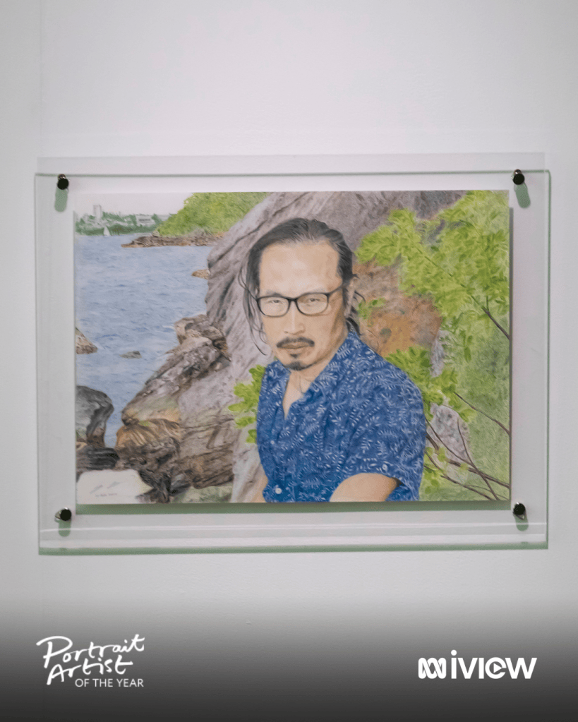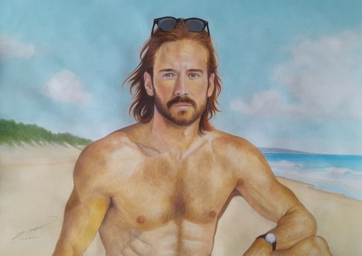
Titled Behind the Lenses, this piece explores the idea of vulnerability. It represents my way of expressing vulnerability as I feel mostly free and liberated when doing it through art and writing.
Using sunglasses as a metaphor in my work, what I’d like to leave with the viewer is: there’s also a time when it’s completely OK to exercise caution and protect our vulnerability hidden in plain sight under the sun…
I’m a firm believer that some things are best left with professionals. For example, designing a logo. And when you have a brother who is a graphic designer with three decades of experience and a formal education and training in Visual Communication from UTS, you don’t go to anyone else.
From concept to completion in no time. A simple instruction is all it takes when leaving things in a professional’s capable hands. That’s what I like most about dealing with professionals: They are just so switched on. They get it. No further ideas need to be exchanged back and forth. In my case, the rest is to give my brother total freedom to express his creativity and work his magic. It’s an important reminder for future commissions: establish this ground rule from the outset.
Now, the story. As blue is my favourite colour, naturally I wanted my logo to reflect that tone in my name, TED TSAI. The word ART sits beneath it in a deliberately larger font, because art is larger than me, while its white colour represents the blank page I face each time I begin a new piece.
The result? It exceeded my expectations with an unexpected added bonus. The muted grey shadow along the lower edges gives just enough shade and form. It’s a subtle element that enhances its three-dimensional feel. I also see it as self-doubt that inevitably occurs when I stare at the blank page. That shadow of doubt is in fact a source of value and depth in art. I’ve learned to give self-doubt a break, and the credit it deserves.
It’s interesting how this little logo has a big story to tell. What’s so fascinating is that it not only showcases the face of the brand, but also the philosophy of my art practice and the creator behind it…
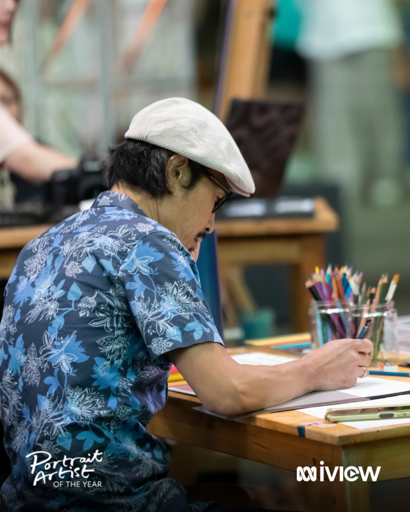
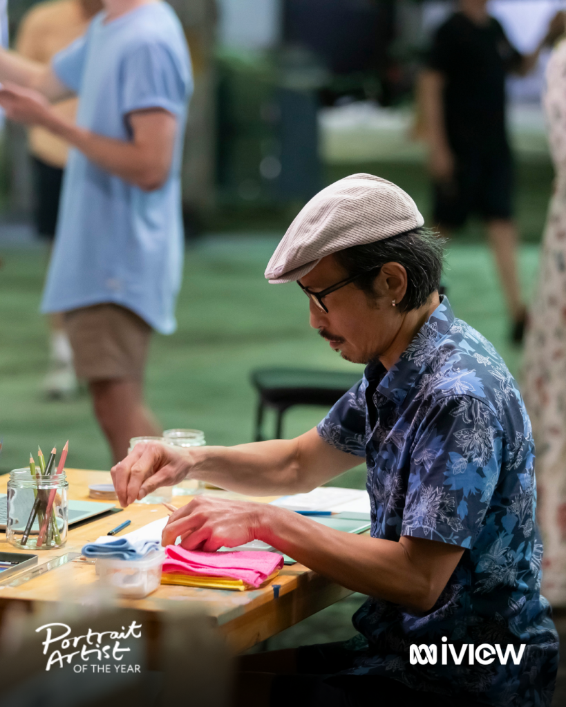
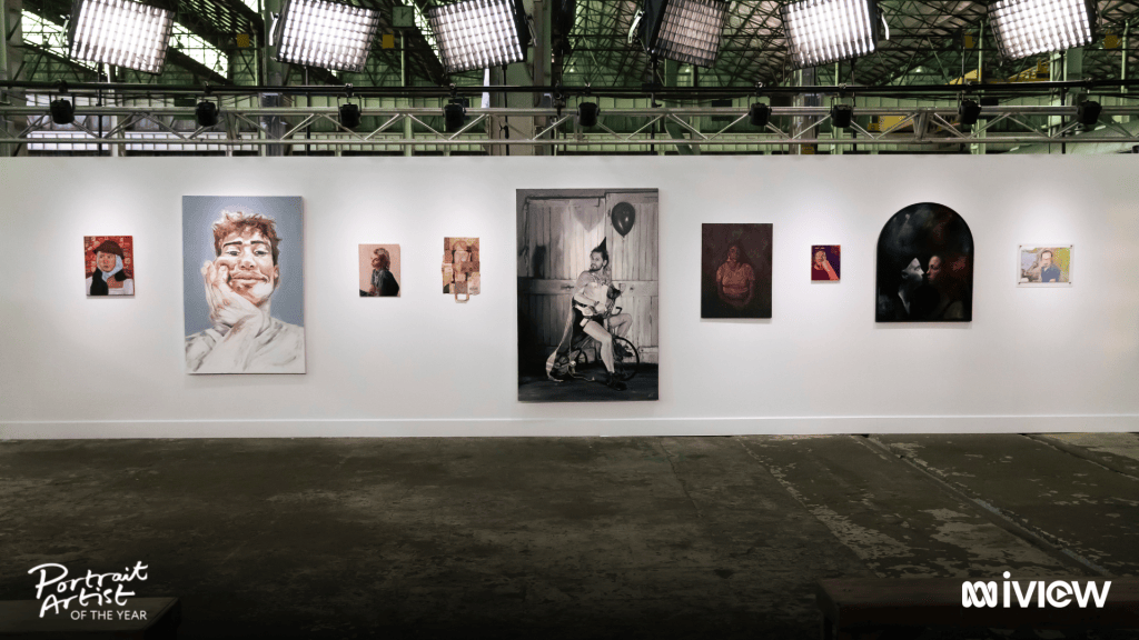
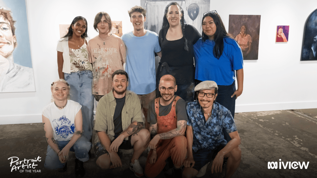
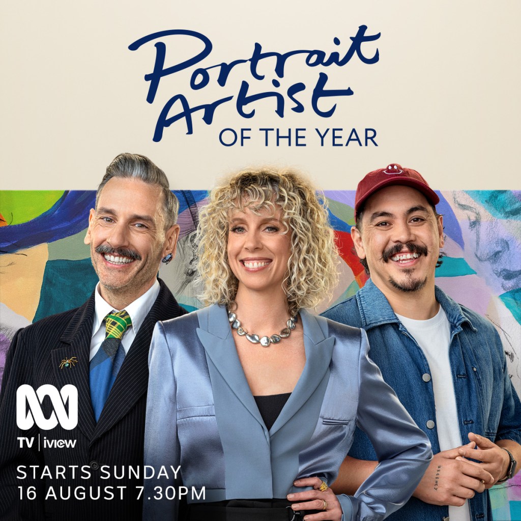
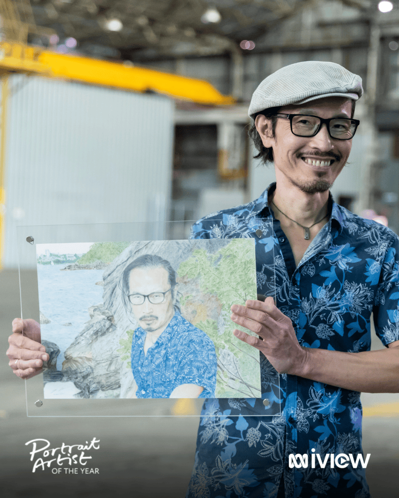
After progressing through multiple rounds of a rigorous selection process, out of close to 2,000 applications, I’ve been shortlisted for Portrait Artist of the Year Season Two.
To get this far is an honour and a privilege in itself. It’s indeed a significant milestone in my artistic journey.
As I stepped onto the set, I had only one goal in mind: show up and do it for the love of art.
Mission accomplished.
Stream Portrait Artist of the Year from Sunday 16 August, 7:30 pm on ABC iview and ABC TV.
They say it’s better late than never. In my case, it’s better slow than never.
A while ago, someone asked me what kind of artist I aspire to be. I remember one of the words I chose was “prolific”. Over time, I realized my work takes time. From start to finish, there are multiple layers of marks before I sign off and file a piece away. So that word has gradually been replaced by “consistent” and “sustainable”.
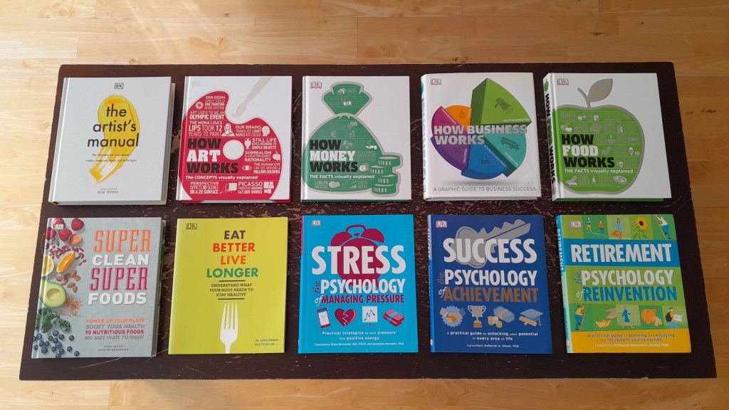
It turns out I’m not only a slow artist, I am also a slow reader.
Here’s my bite-sized rhythm: just two pages a day, five days a week. Slowly but surely, I recently finished my ninth book from cover to cover. Think of compound interest: slow and steady. Now my tenth is following the same magical pace.
No exceptions? If I anticipate a no-reading day for whatever reason, I make sure I take a “cheat day” today by reading four pages instead. Why? I’d rather be one step ahead than one step behind. Playing catch-up is never a fun game.
They say leaders are readers. Maybe. In my corporate days, I would’ve loved having a fancy title, but I was not a reader then. Now, I love calling myself a reader. It’s a title I can have for life. It’s not given, it’s earned. There’s no sign of stopping. You don’t call it lifelong learning for nothing…
This artwork, titled Bohemian, is about choosing your creative path, even in the face of pressure to conform. The soft, muted tones reflect an identity shaped by quiet presence and the courage to express one’s artistic self.
It arrives at the right time, as this month marks my fifth anniversary of following my calling. Beneath the brushwork lies a personal story of my lifelong pursuit as an artist, marked by a transition from the corporate world to the art world…
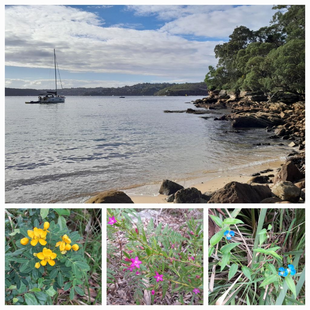
Sunday is my beach day, a rest day, but my mind is thinking about art all the time.
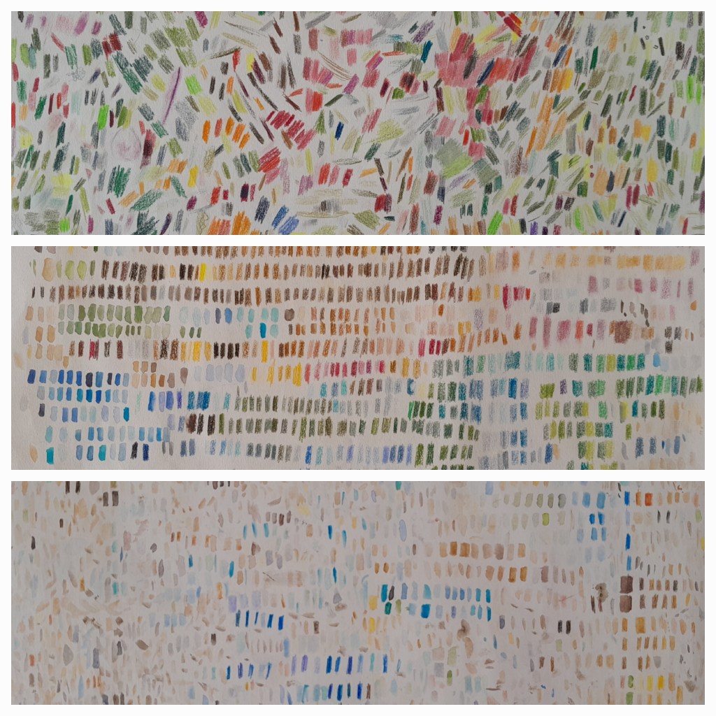
Here, three types of wildflowers flourish on their own in autumn, each representing a primary colour in the palette. Nature knows best. A little deliberate observation goes a long way.
A while ago, someone asked me where and how I find inspiration for my artwork. Let this be my answer…
This artwork, titled The Coastal Life, is close to my heart. It reflects not just a beach scene, but a way of living. It’s inspired by the ideas of presence, simplicity, and a love for the coast.
To me, it’s a visual reminder that your dream life might be closer than you think. It’s not necessarily about material things like owning a beach house or having everything within reach. It’s as simple as showing up, being present, and becoming a regular at the place where your heart feels most at home…
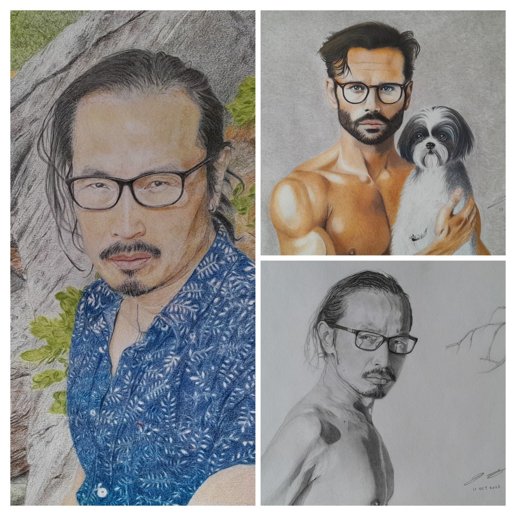
Titled Father and Son, my first artwork of 2025 explores the theme of connection. It reflects my attempt to revisit the early days of life when we are first loved and cared for. The puppy symbolises unconditional love.
The father-son relationship evolves over time, shifting through different stages – sometimes for the better, sometimes for the worse. There’s an unspoken aspect to this bond, especially as we transition from boyhood to manhood.
I hope this artwork invites you to see your own stories within it…